
PRS For Music
Role: Lead UX
Time Frame: 6 months
Internal tooling, Strategy, Branding
PRS for Music is the home of the Performing Right Society (PRS), they pay royalties to their members when their work is performed, broadcast, streamed, downloaded, reproduced, played in public or used in film and TV. This is achieved by collecting royalties through licensing agreements with music users. This project was focused on streamlining owed transactions through internal tooling.

Context
🗒️ With over 100 years experience representing their members. The complexity of the business model has grown, ‘bolting on’ additional processes and databases making work processes fragmented and messy. Current processing of owed members royalties involved multiple departments and silo’ed databases creating inefficiencies.
Challenge
⚡️ Design a new admin dashboard where internal PRS staff would log in and manage all client records and payments . I played a leading role in the product strategy helping to ensure the project was always going in the right direction (What should we build? Why should we build it? When should we do it?)
Make the process of verification for royalties and payments a simpler, more efficient process. This would It would be implemented as the new ‘Admin Console’.
Discovery
Current databases used had been taken as a starting point for functionality required within the new Admin Console.
They mostly replicated current behaviours which under interrogation could be seen to be simplified and made more user friendly, an example of this was abstract terminology and the use of multiple ID’s which would require initial training for staff.
I wanted to investigate why certain processes were done in such a way and if there was a need to simplify this even further through the new application
Research key insights
UI familiarity
PRS staff were had a preference for ‘Excel’ styled application design. The current software and databases used all remebled a database design and most people spoke to incorporated their own data into some sort of excel sheet in one way or another.
Classifications
There we a lot of ‘ID’ codes within the current models used in the reporting processes. We challenged if and why this may be necessary and whether we could look to make them more user friendly and reduce initial onboarding for any new staff.
Third party integrations
A lot of user flows interacted with third parties so were constrained by how much flexibility we had and were to be handled with caution with updates to the system.
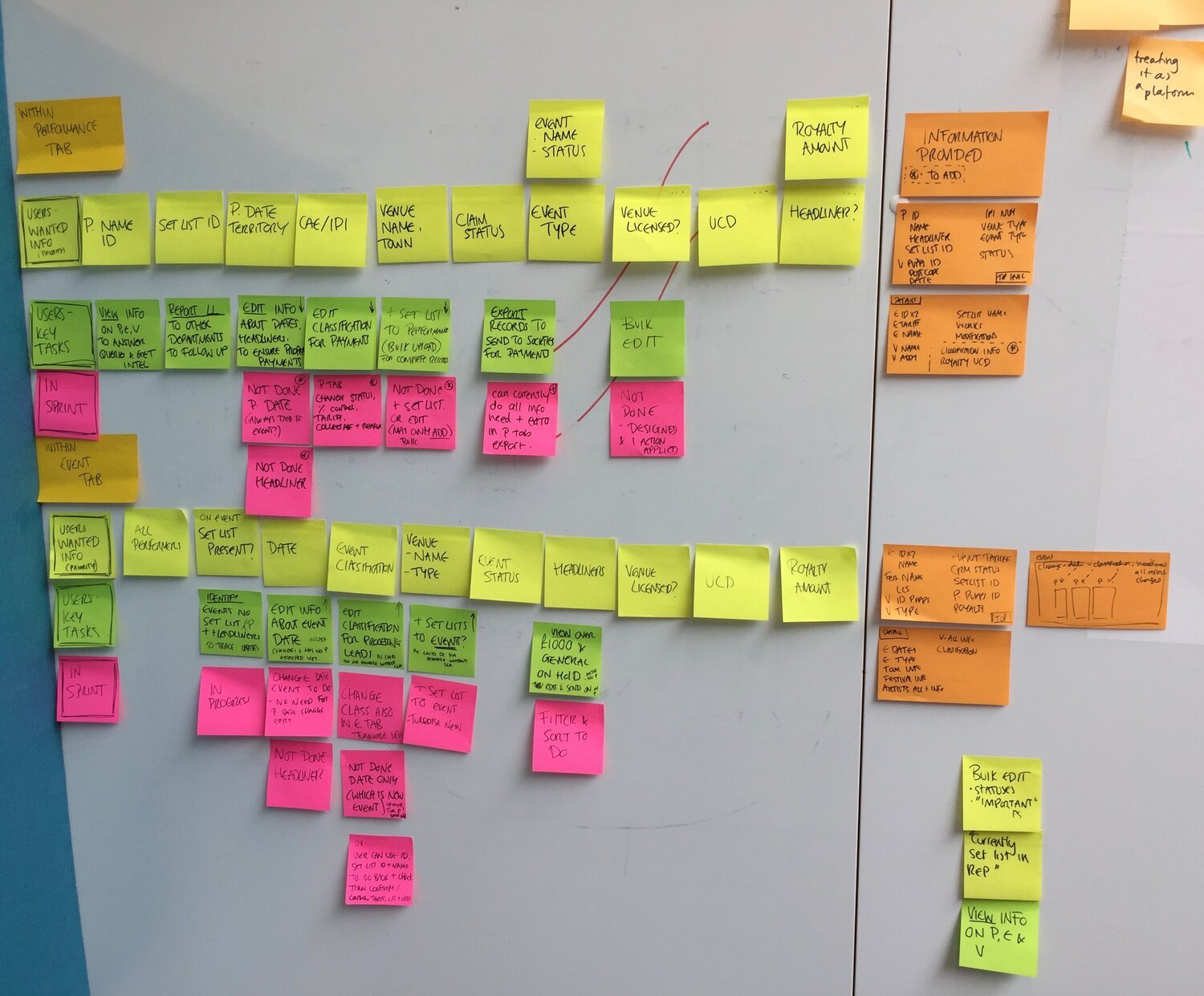
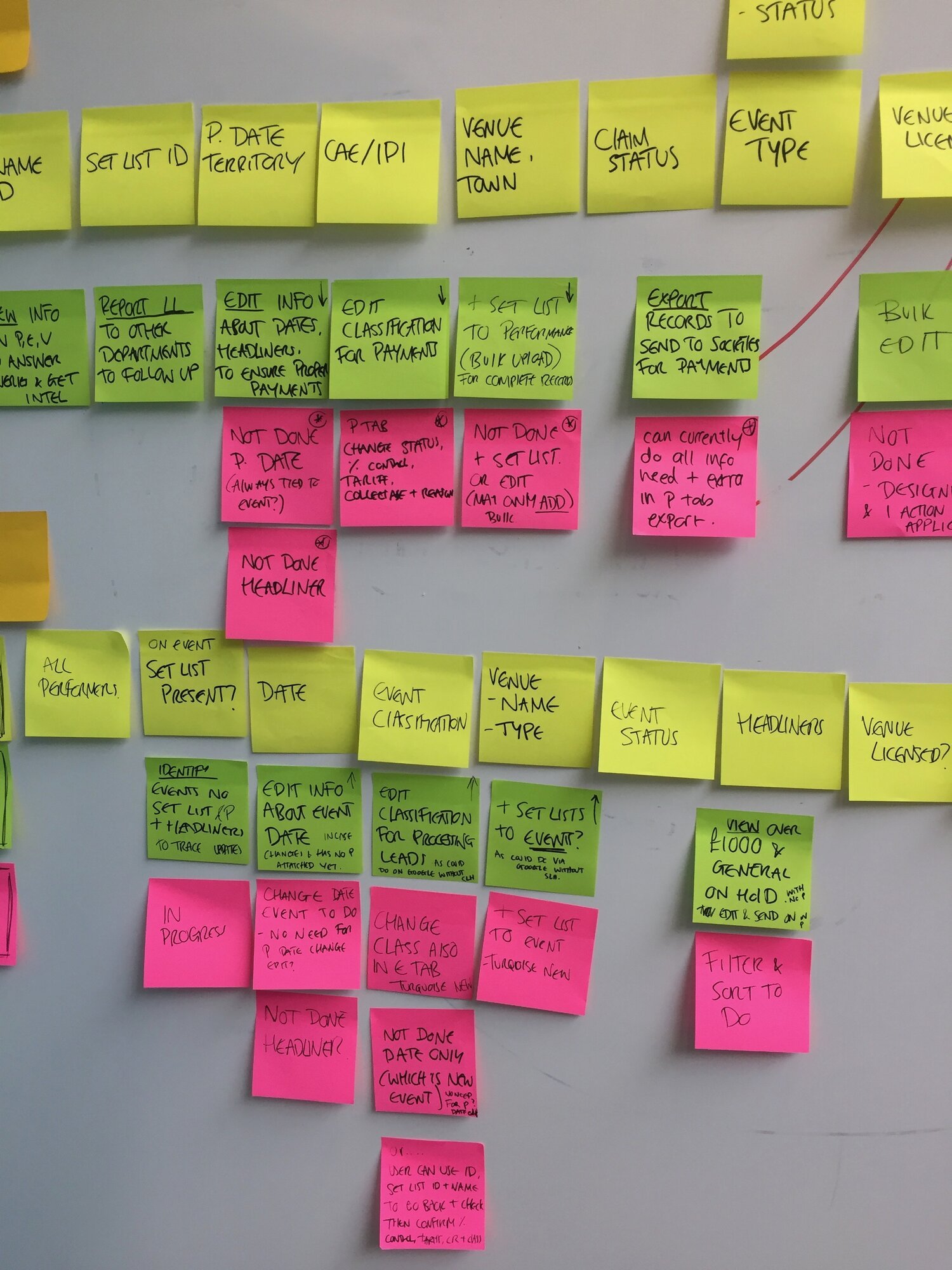
Impact mapping and feature prioritisation
Handling multiple department requests
A way we did this was to categorize these with key stakeholders of each department, then using a grading framework for how they would prioritise additional ‘requests’ in relation to improving efficiency in their workflows.

Initial designs
Results from the matrix were analysed taking into consideration the overlap of different departments. The task flows broke down into 3 main areas for processing royalties.
Performer royalties
Venue licensing
Event licensing
For each of these sections there were well defined workflows that fell within each, this therefore created an initial basis in which multi-disciplines teams agreed would be the best approach.

User Testing
Through multiple rounds of testing it was seen that PRS members liked the designs use of navigation through ‘Performer’, ‘Venue’ and ‘event’ as it fit in with their current mental model and ways of working.
Progressive enhancement was applied to to complexity and quantity of information needed within trasactional flows.
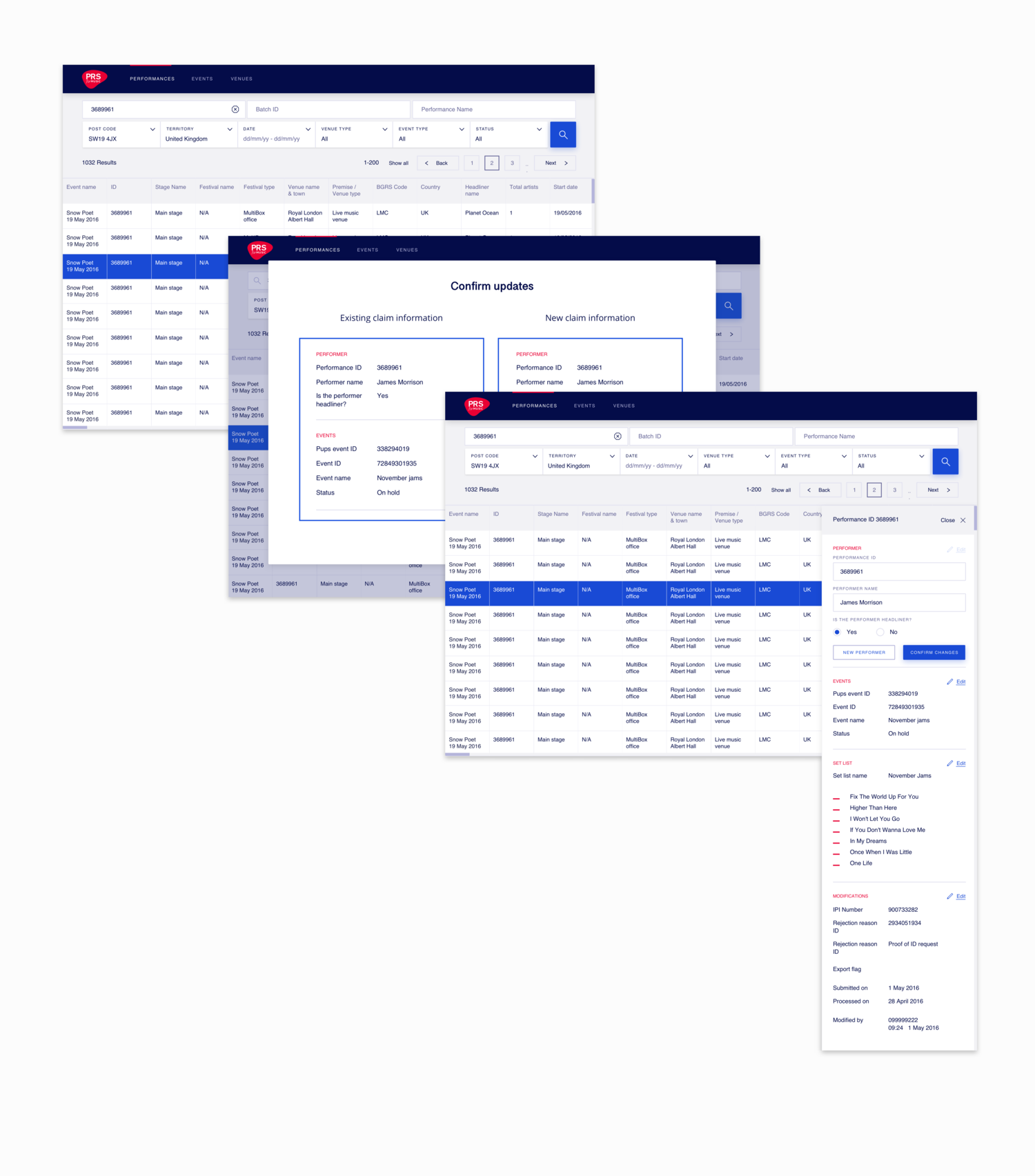
A key principle here was finding the records quickly. Which again needed tight iterations with PRS staff as we worked on what should be prioritised as ‘surface’ information vs what could be left as ‘detail’ information.

Design
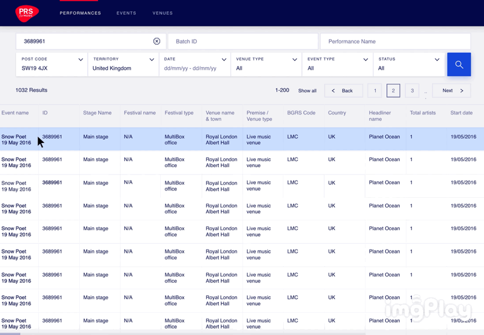
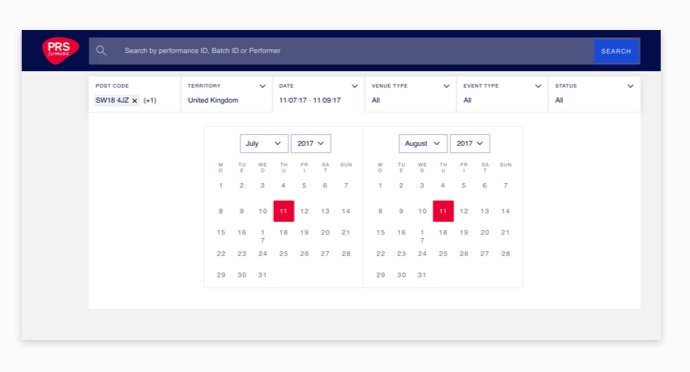
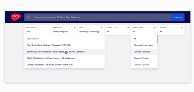
Filters were created using conventional patterns, again, ones that the primary audience would be familiar with.
We did however have to be pragmatic in all design decision as this was a hard deadline and we knew that utility came first.
To help with usability I applied constraints to column amounts as this would hinder legibility and avoid horizontal scrolling.
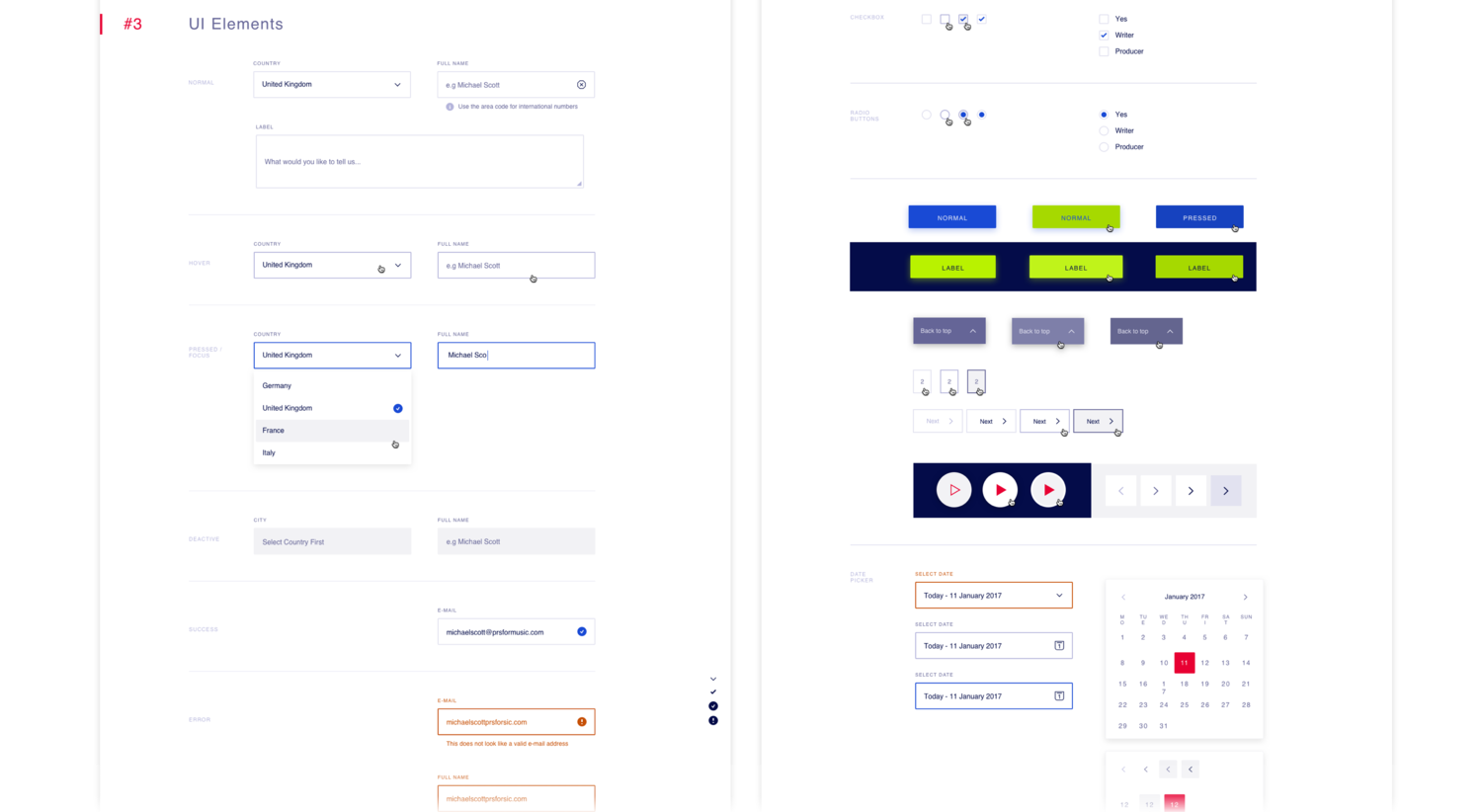
Prototyping
Branding really helped bring the prototype to life and the clean, branded application was a relieving breath of fresh air for users who were used to old clunky sheets that took a long time to load. Small additions like loading spinners even helped to lessen the burden of waiting for load time (even though it was already significantly reduced)
We used style guides and components consistent with the rest of the PRS suite where possible.
Delivery
Through delivering the build of the design I can honestly say this was the most streamlined, Agile ways of working I have had to date. Through the use of Jira, our cross functional teams had clear user stories, the different scenarios that may need to be accounted for within that story (different states) and acceptance criterias. Each story was thoroughly QA’d by all team members to see that it was integrated worked as expected in all aspects backend and front end.
The final rollout had an onboarding process with documented help centres as well as open feedback loops so that comms could always be accommodated for if there were further things to be looked into.
The final application was able to put the old databases into redundancy and this was a big success. Overall usability and efficiency had increased with the help of the Admin Console that would continue to grow and develop.
